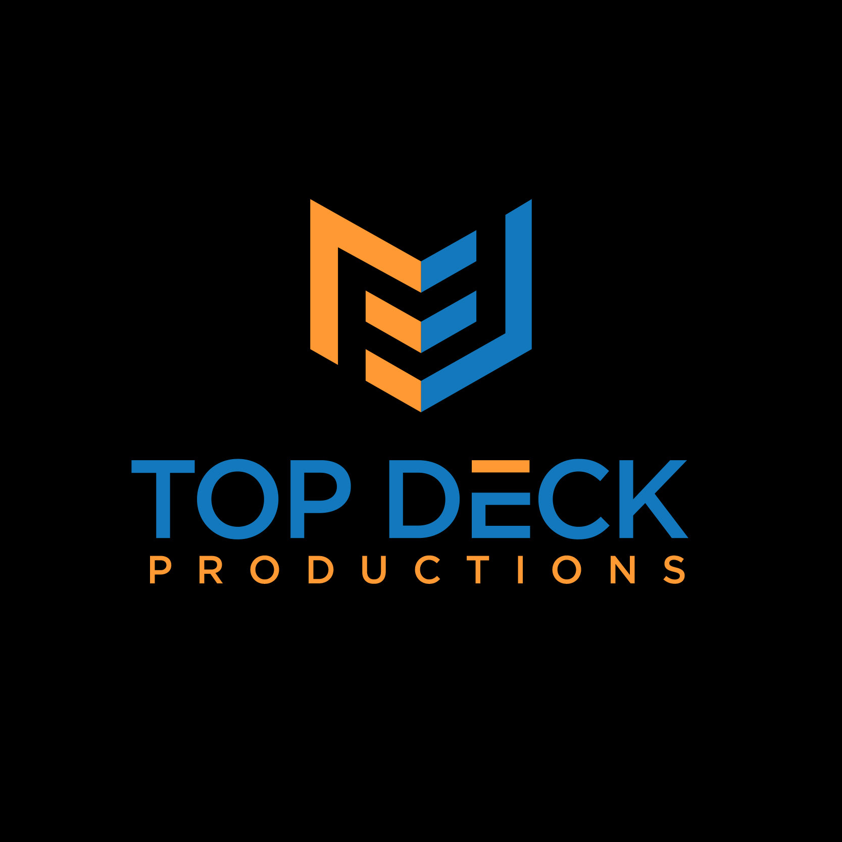
Top Deck Productions, a Magic: the Gathering streaming service, came to me during the Summer of 2017 for
help with updating their logo and applying it across multiple mediums. As part of an ongoing brand-refresh,
I was tasked with creating a new logo that could be used on websites, banner ads, social media, t-shirts,
business cards, and more.
help with updating their logo and applying it across multiple mediums. As part of an ongoing brand-refresh,
I was tasked with creating a new logo that could be used on websites, banner ads, social media, t-shirts,
business cards, and more.
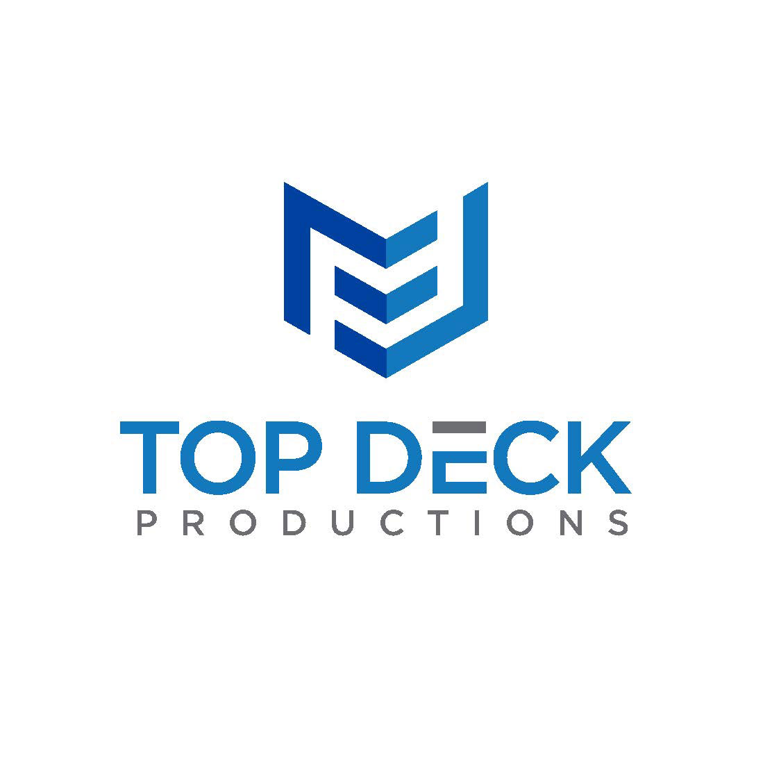
The chevron icon represents a deck of cards in isometric view, while the top crossbar of the "E" is meant to
evoke the top card resting on the stack. In card game slang, to "top-deck" is to draw the perfect card for the situation right off the top, just when you needed it most; it's all in the luck of the draw. Top Deck Productions
seeks to capture those exciting upsets in its broadcasts of live Magic: the Gathering matches, so it seemed
fitting to highlight that top crossbar with a different color. The next card you draw could be just what you
need to turn the tide, waiting on the top.


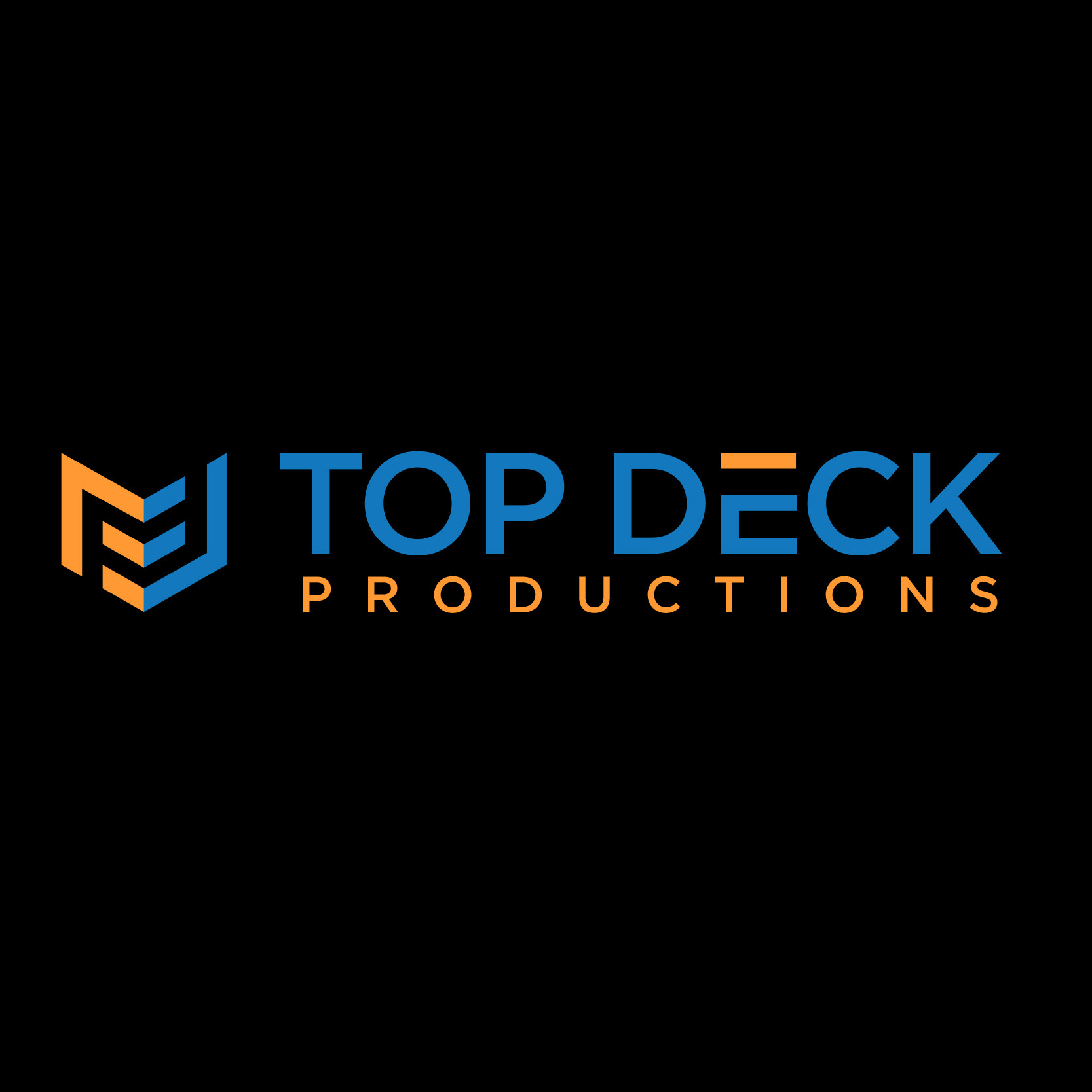
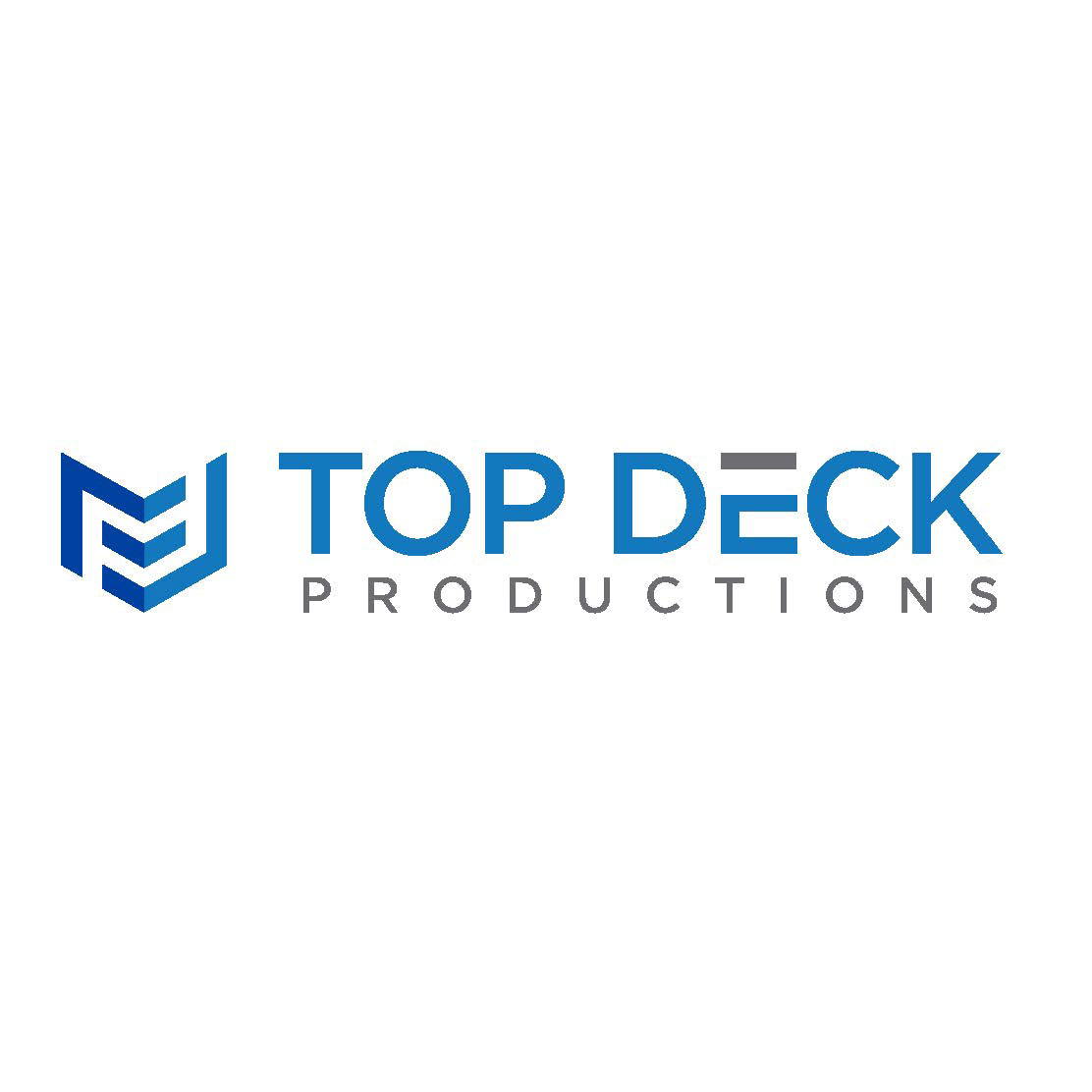
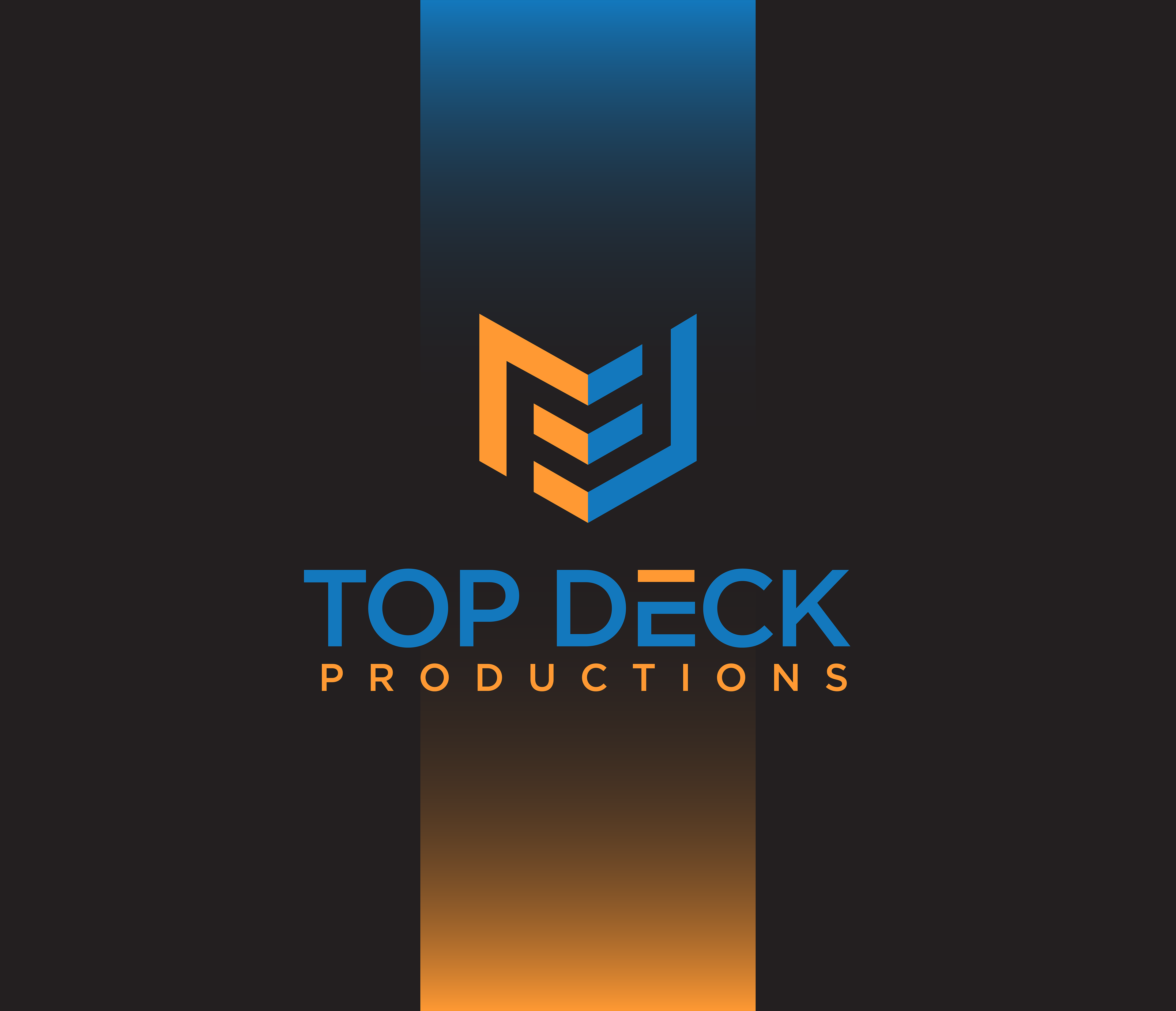
Several arrangements of the logo to fit multiple formats, including the default colors
on a black background and an alternate color-scheme for use on white.
on a black background and an alternate color-scheme for use on white.
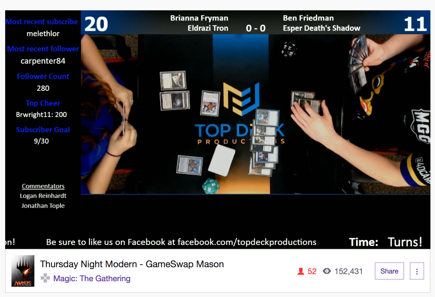
As one of the more important applications of the new branding, I also designed this two-player
playmat to prominently display the new logo front-and-center on their nightly stream.
playmat to prominently display the new logo front-and-center on their nightly stream.
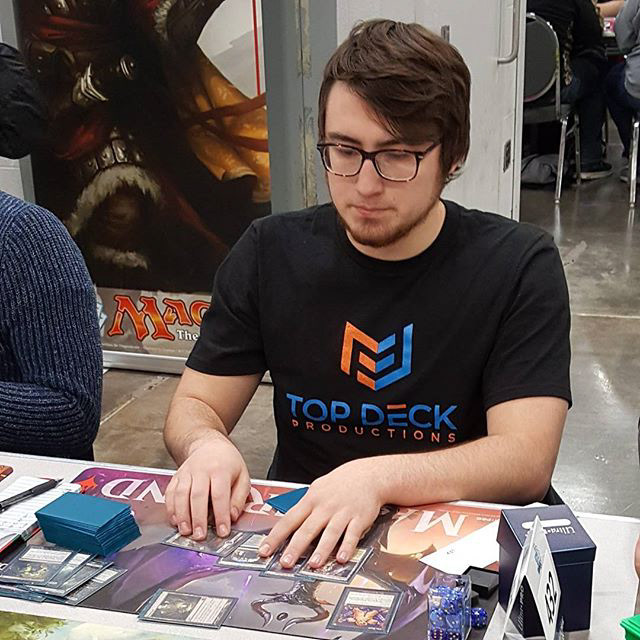
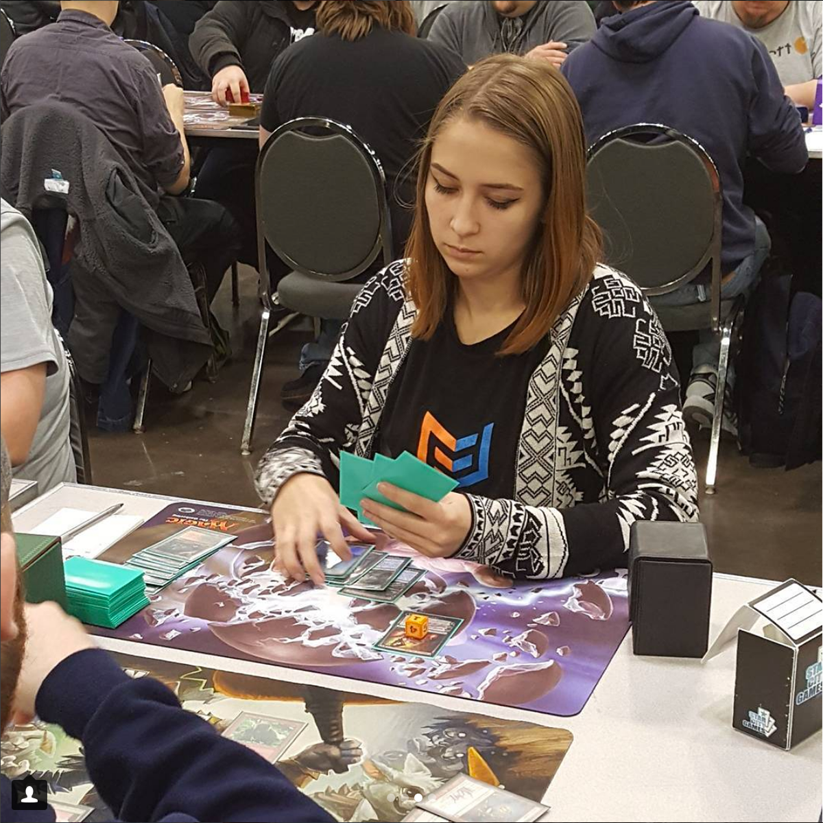
Two affiliates of Top Deck Productions proudly wearing their
team's colors at a major tournament in Columbus, Ohio.
team's colors at a major tournament in Columbus, Ohio.